

I liked the general idea, but I definitely didn't want to use primary colors. I went to Etsy to locate some alphabet letters and found a set for cheaper than I could have bought them individually at Hobby Lobby. However, if the wood work at Hobby Lobby went on sale and you don't mind their limited style options, it could be cheaper then buying a set like this, which I got for $75:
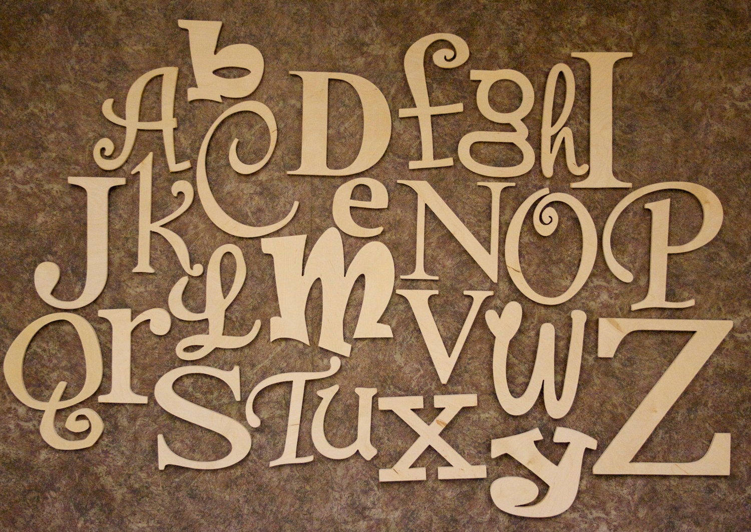
These are not small letters, they range from 5 inches to 12 inches in height (much bigger than Hobby Lobby) and take up an area of 4 ft x 7 ft of space on the nursery wall.
Here are the spray paints I either had or bought for this project (I ended up not using the cream or light brown):

First I laid out all the letters on cardboard in my yard. If you lay them flat on the grass you will end up with grass streaks in the paint. Avoid!

I primed the letters first, which probably helped the second layer of paint stand out brighter, but in retrospect it was probably not necessary.


Then I laid out the primed letters in a general formation of how I thought I might put them up on the wall so I could decide which letters to paint each color.


I am pretty OCD so I actually created a note on my phone to separate the letters into colors. Ha! This way I could make sure I had spread them out.

Spray all the letters and let dry for at least one hour but no more than 48 hours.


Okay, here's the important part: Make sure that whatever brand of crackle paint you use (I used Valspar via Hobby Lobby) that you use the same brand of primary paint. For the orange and blue I used Valspar but I used Krylon for the brown, so when I applied the crackle paint it barely did anything to the brown letters (as seen below). I ended up having to repaint all the brown ones in Valspar paint and then re-crackle paint them.

The more layers of crackle paint you apply the more it cracks. It seems weird at first, because the cream paint filled in the lines and I thought I screwed up, but sure enough, they cracked even deeper and wider than before.
Here is what a good crackle looks like (the colors shine through brighter in person, all these pics are via my iphone)
Here is what a good crackle looks like (the colors shine through brighter in person, all these pics are via my iphone)


I don't have a picture for this step, but once the letters were all dry and crackled I used sand paper to rough up the edges and create some streaks on the letters to give them a worn look.
Then I bought craft sticky tape (two sided, thick tape meant for hanging light items) and made sure to be generous in sticking plenty to the back of each letter (don't want any letters falling onto his head in the middle of the night!).
Finished product!


Final Thoughts:
1) It took me about 3 hours to do all of the painting, but it probably would have been much closer to 2 if I hadn't primed and didn't have to redo the brown letters.
2) I really liked the touch that sandpapering the letters added.
3) I put the sticky tape on and then let them sit over night before putting them up just to make sure they were firmly adhered to the letters (I didn't want the tape to just stick to the wall and the letters fall off).
4) Have a friend help you put them up, I had to rearrange a couple of my letters because I kept getting off my chair and seeing if they looked right from a distance.
No comments:
Post a Comment